Designing Photo Books | The Cobbler Series
Ok, so we’ve talked about how to organize your photos, and we’ve talked about how to automatically print the photos you share on Instagram. We even started talking about printing family photo books — the how and the where, that is. I saved the next topic for its own post because – let’s face it – this one’s hard. Designing the actual pages of your photo book is time consuming and overwhelming, so … I’ve got some tips on how to get it done fairly painlessly for you today.
- Keep it simple
There are a few reasons that I like to keep my storybook albums – and my personal family photo books – very simple. The first is that simple, to me, is classic. It will never go out of style. Not so fancy layouts and colorful photo frames and whatever the trend of the week is. The bigger reason, though, is that simple is just easier. And easier = more likely to get done.
So, my pages highlight my favorite photos on a white background. White space is nice, and using that creatively can add visual interest without adding clutter or distraction.
- Prioritize
If you’re like me, you’ve got a LOT of photos. Start the design process with the expectation that you’re NOT going to include every. single. photo. in the design. A little organization on the front end will save you tons of time when you’re designing the layouts. Knowing going in which photos will be included in the book, and which will be the “heroes” will make designing the actual pages much easier, since you’ll have only the actual photos you’re using in front of you and you’ll know from the start which ones you want to highlight in the design.
I used to do this narrowing down process by printing out every photo as a 4×6 print and making piles (you know, back in the dark ages) — “faves”, “to include”, and “to exclude.” These days I use electronic resources (Adobe Lightroom) to rate and categorize my photos. Figure out a method that works for you.
- Keep it clean
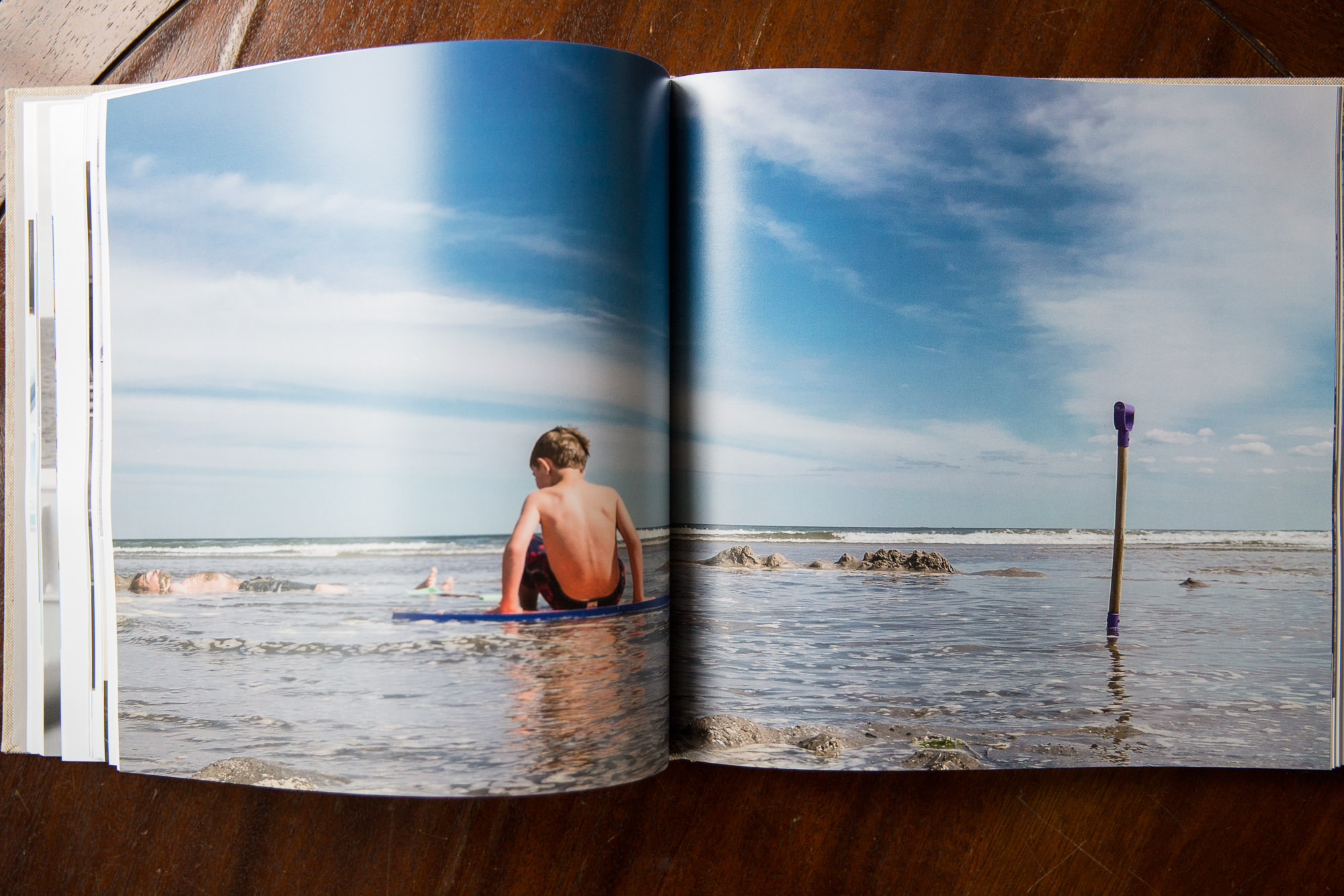
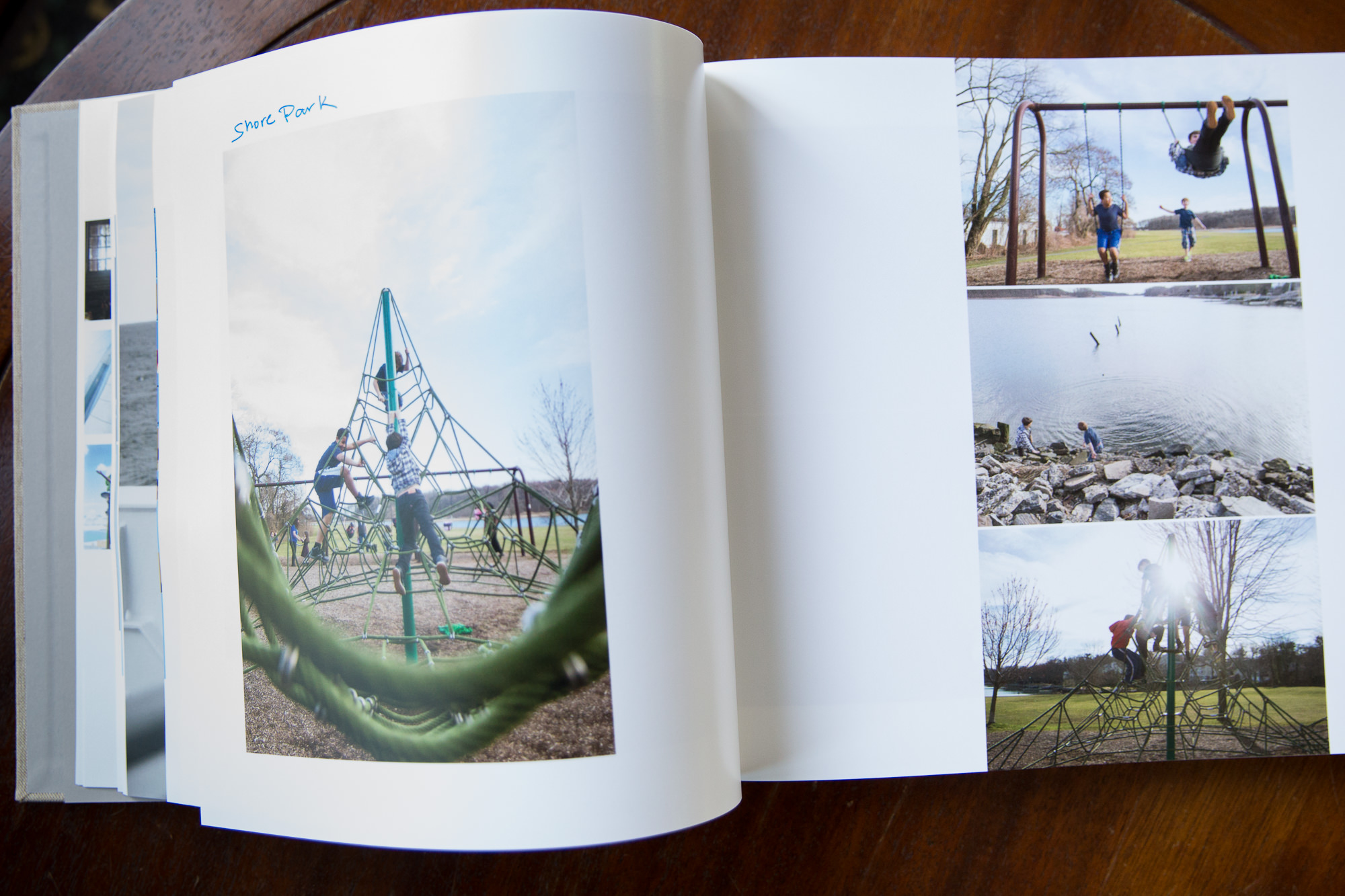
Let’s face it – you want your favorite, favorite photos to be BIG. So that you can drink in every detail when you go back to the book again and again. I like to choose a “hero” shot for each spread and print it large on one side of the spread. On the other side, I include a few smaller, related images that complement the hero.
- Don’t forget to tell the story
Don’t be so brutal in your culling process that you eliminate those little ‘in between’ moments and details that tell the story of your life. A book full of photos of uniformly perfect smiles will be nice to look at, but it won’t be nearly as interesting in one that really tells your story with introductions, transitions, and details — just like a real story.
Every so often, there’s a photo that warrants a full spread in my book.
- Remove roadblocks.
What holds you back from getting your books designed and ordered? Think about it. Can you just leave that part out? For me, it used to be torture coming up with the little titles and captions and commentary that I thought should have been part of the design of my albums. Argh, they sounded so CORNY after a while. I would cringe imagining myself reading these captions years down the road. So I’d walk away and promise myself I’d get back to it once my creative caption juices were flowing more freely. Well. You know what would happen then. (Hint: Nothing).
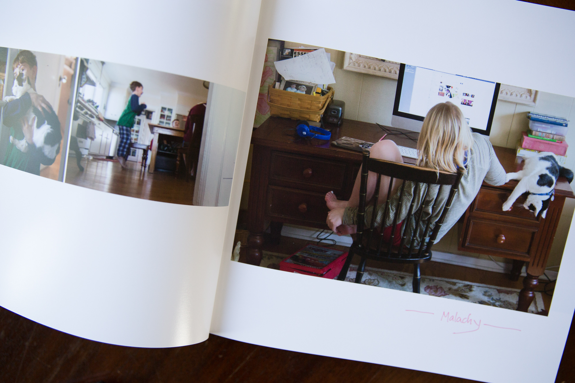
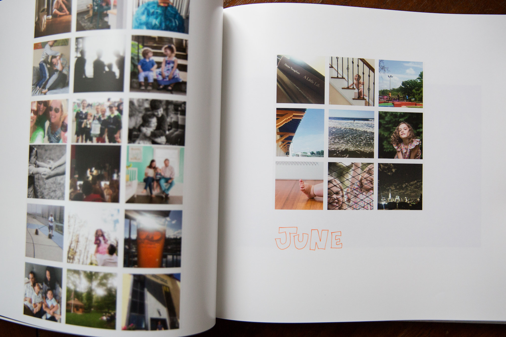
Now, there are no words in my album designs. None. Not a single title or caption. I DO have a method for delineating the months of the year, but there isn’t a single letter of the alphabet included in the design.
I use the thumbnails of the months worth of Instagram posts to mark the beginning of each month. They’re fairly tiny, but that’s OK (see THIS post — I’ve got these nuggets printed larger elsewhere!). Then, weeks later, when the book has arrived and is sitting in my lap, I take a sharpie and add whatever titles or captions that move me. Maybe little details or explanations that I think are necessary. Sometimes, this becomes a family affair and we do it together. Sometimes it’s just me. Either way, it adds a slightly more personal touch and words can no longer prevent me from finishing the job of getting the book printed.
- Include Digital Backups
This, I think, is pretty awesome – I know I mentioned it before. I came up with this idea one day when I watched my daughter taking iPhone photos of the pages of one of our family photo books. My first photographer instinct was to think, “Noooooo! The quality of those reproductions are going to be awful!” I got over that quickly, though. Her method would get her something that was fine for her purposes, and I DID want her to enjoy the photos however she pleased. But it occurred to me that what if she did want a full res version of one of the photos in these books? Would she know where to look? Answer: definitely not, and if I caught her nosing through my computer hard drives looking for the photo she wanted, she’d likely lose her life 😉 So. Now I burn the photos from each book onto a disk and tape it to the inside cover of the book. Genius, right?
- Use the many resources available
So, how do I actually design the books? Right now I’m using a professional album design software that isn’t likely feasible for the casual family photojournalist. Before taking the plunge on this, I tried many methods. The most straightforward method is probably dragging and dropping your photos into premade layouts available through the album company you choose. When you’re choosing an album company to print, consider whether they offer templates that fit your needs. Artifact Uprising allows you to design your book right within their ordering system and provides multiple clean, classic layouts. Blurb offers a free software that gives you more flexibility with its included layouts. (This makes it more complicated, though, so if designing layouts is your road block, keep it simple!) You’ll have to shop around and see what works for you – there is something out there for everyone.
Do it.
Do it.
Do it!
To me, there’s no better way to enjoy your favorite photos. You’ll be SO glad you did. Have any other questions about designing family photo albums? Tell me. Leave a comment or click the contact button above. Ideas for other Cobbler Series topics? Same!
Good luck, and thanks for looking!
~Jaye
P.S. As my LYYP clients know, I ONLY schedule newborn sessions during the summer. This is because we are mostly away and because all my kids are home all the time and because I need some free time to catch up on the back-end business side of things AND because summer is my time to really focus on the “life” in my own “years.” BUT. I do occasionally take on album design projects during this time. Yep, I’ll organize your wedding photos and print them in a custom-designed Storybook Album. Or those disks of photos from the multiple photo sessions you did with another photographer before you knew me — the ones you SWORE you’d make an album with when you had time. Want me to help you get them off the disk and on the shelf? Drop me a line.
P.P.S. All my Cobbler Series blog posts are indexed HERE, so if you enjoyed this and would like to read more about getting your photos from pixel to REAL, check it out. And if you are enjoying this series, please tell me! I need to know that someone out there is reading these and thinks this is a good use of my time. 😉
annual thankful video
worth a click:
when to book
photo tips
product guide
faqs
kid tips
join the list
I drop in occasionally with tips, deals and announcements. Want to be the first to know?
Jaye McLaughlin is an award-winning newborn and family photographer serving Westchester, NYC and beyond since 2010.
sign me up


